Calum Harbison Design Portfolio
2023 NEW Mock Ups - MITW.png

Music in the Wild


Music in the Wild

Uniting the World Through Music and Adventure

Branding / Naming / Brand Strategy / Digital Design


Music in the Wild is a charity trip and festival package that has been created by Charity Challenge. The premise of this idea is that people can apply – raise money for a chosen charity and complete life changing challenges in iconic locations around the world. Following this, all participants will then attend a music festival supported by a global music sensation. The client required a brand, naming and a digital platform for marketing and trip booking.

 
Logo-V2.gif
 

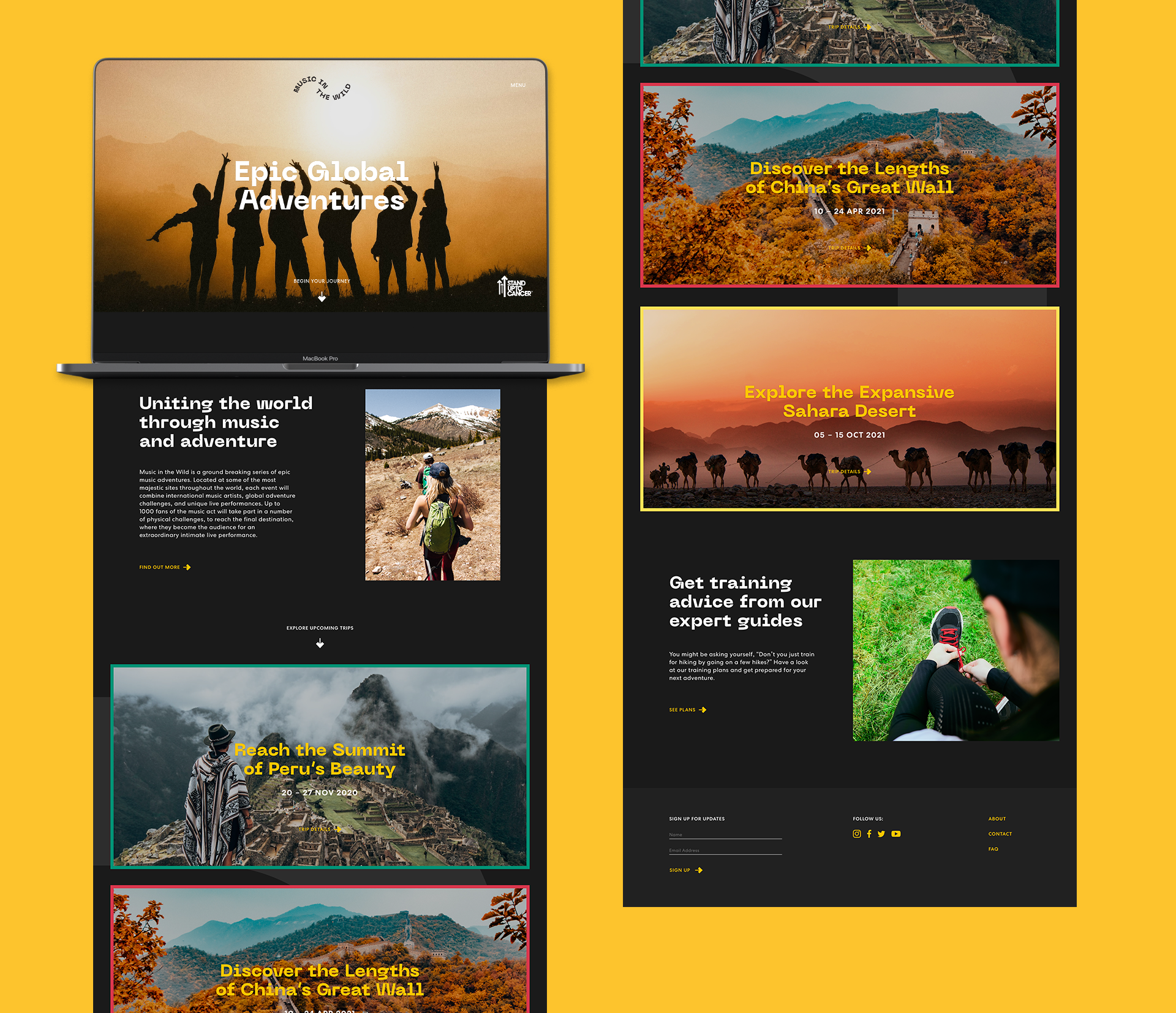
The branding concept was titled ‘I was there when’, which can be applied to a range of scenarios ranging from experiences to achievements. These key moments that occur along a participants journey, through fundraising to the event itself, were key in influencing the brand visuals.


Brand Thinking-04.png
 

Music in the Wild will have trips and concerts dotted around in the far reaches of the world. This variety of settings is represented in it’s broad colour scheme. Each shade is inspired by the many locations participants will visit on their adventures.


_Brand-Colours-1.gif
 

The ‘Journey Line’ is a integral visual element in the brand language. It connects the various experiences and challenges encountered along a persons the journey with Music in the Wild. The moments along the Journey Line are populated with either photography or iconography to illustrate the event happening.


Photo Selection 2-11.png
 
Comp-1.gif
Comp-2.gif
 
Icon Posters.jpg
Icons-10.png
Direction Posters.jpg
 

Abstract iconography is used to offer a simplistic alternative to illustrate along the Journey Line graphic.


bands.jpg
lanyards.jpg
Icons-09.png
 

In large scale print, the Journey Line device is used at a larger scale to create a higher level of impact; with a focus on one particular key moment.


Billboard 1.jpg
Billboard-2.gif


Digitally, the brand makes more use of black as a neutral base, allowing more freedom to use the brands wide array of colours for meaning and to distinguish between locations.


MITW Mobile Digital.png
MITW Macbook.png
MITW Macbook 2.png